How Color is Utilized Effectively

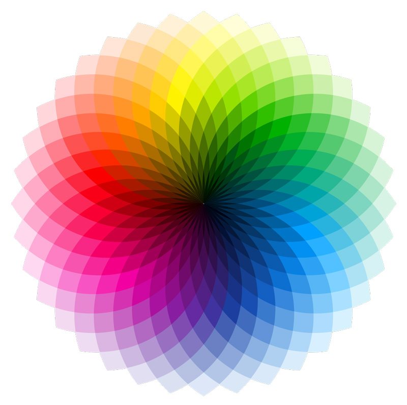
These contain analogous colors which exist together on a color wheel.
They can be complementary and opposite to each other. Or they may be split complementary colors which includes a primary color and the two colors on both sides of its complement.
The Significance of Color in Graphic Design

Emotions Evoked by Color Variation

Color is a powerful tool which evokes numerous emotions and reactions as revealed by the following examples:
- Red: Induces passion, power, joy, leadership, vigor, and activeness.
- Black: Powerful, functionality, mysterious, elegance, and sophistication.
- Yellow: Optimism, childlike, law, education, freshness, and arrogance.
- Green: Natural, healing, calm, generosity, trees, wealth, money, endurance, and protection.
- Blue: Security, wisdom, confidence, loyalty, trust, among others.
However, the lightness or darkness (value), saturation, and hue of colors can change how they are perceived. It is crystal clear that color is not just for aesthetic value, but delivers an intrinsic value to its viewers.
Contact us today if you need any assistance with graphic design, web design, and digital marketing.


